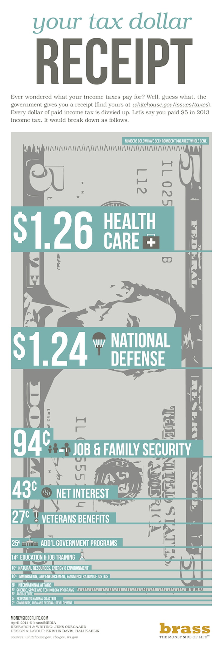
Let’s be real: no one likes paying taxes – not you, not me, nor does anyone else enjoy it. It’s quite frustrating to be excited to get your paycheck you so earnestly slaved for only to have a huge chunk of it taken away for “taxes.” What ARE taxes, anyway?! Most people don’t know what exactly taxes even go to, which makes us even more annoyed and frustrated since to us it just means hard-earned money leaving the tips of your fingers before even getting to it. To lessen the blow of having taxes taken out as well as to simply inform, the following graphic breaks down just what your taxes pay for.
The infographic breaks down an example of paying five dollars in income tax for a single year. While no one pays just five bucks these days, it gives a pretty solid idea of just how much each reason weighs compared to the others.
The top dog in taxes goes toward health care, closely followed by a hefty chunk going to national defense. In third place is job and family security, with less than fifty cents going toward net interest. Filling up the middle bracket includes veterans benefits, additional government programs, education and job training, natural resources, energy and environment, and immigration, law enforcement, and administration of justice. In the single digit cents bracket are international affairs, science, space and technology programs, agriculture, response to natural disasters, and lastly, community, area and regional development.
While it may or may not take away the feeling of pay-day resentment, at the very least you have more of an awareness of where your money goes – and it’s not necessarily down a dark, dark hole!

Infographic Source: Whitehouse.gov
Photo by Joe Raedle/Getty Images

Comments
Loading…