Ever noticed how some people just look expensive, even when they’re not wearing designer labels? The secret often lies in their color choices. Mastering sophisticated color combinations can instantly elevate your look from ordinary to luxurious without breaking the bank. These carefully curated color pairings create visual harmony that signals quality and thoughtfulness—the hallmarks of high-end style.
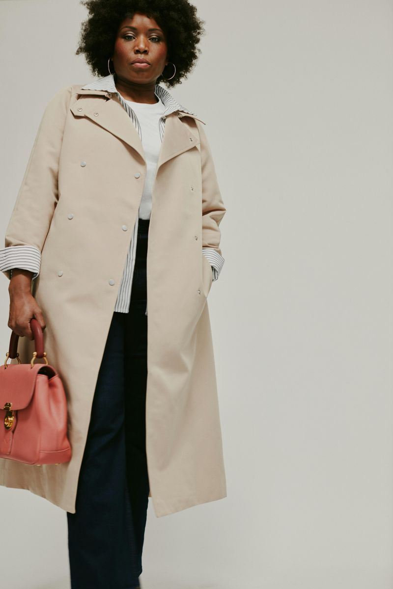
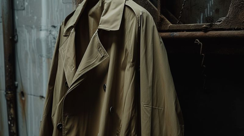
1. Camel & White
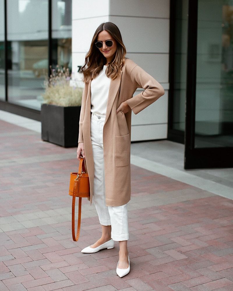
Camel and white create magic together in the fashion world. The warm golden-brown tones of camel exude luxury, while crisp white adds a refreshing counterpoint that keeps the combination feeling clean and intentional.
Natural fabrics enhance this pairing beautifully—think a camel cashmere sweater with white linen pants, or a structured camel coat over a white silk blouse. The combination works year-round, defying seasonal rules.
For maximum impact, play with textures within this color scheme. A smooth white shirt against a textured camel skirt creates dimension that catches the light in different ways, mimicking the thoughtful design details found in luxury collections.
2. Navy & Cream
Royal and refined, navy and cream together create an air of quiet confidence. Unlike harsh black and white, this softer pairing feels more approachable yet equally sophisticated, bringing to mind luxury yachts and seaside mansions.
The depth of navy provides structure and grounding, while cream adds warmth that flatters every skin tone. Together they create a balanced palette that works beautifully in both tailored and flowing silhouettes.
Try a navy blazer with cream trousers for a business setting, or reverse it with a cream sweater and navy wide-leg pants for weekend elegance. The combination particularly shines when accessorized with pearls or subtle gold jewelry—understated additions that enhance without overwhelming.
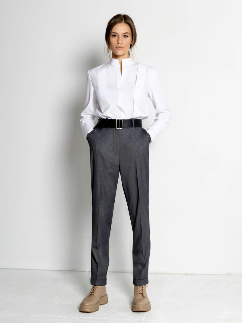
3. Charcoal Gray & Blush Pink
Unexpected yet harmonious, charcoal gray and blush pink create a contemporary dialogue between strength and softness. The deep, smoky tones of charcoal provide a sophisticated foundation that allows blush pink to appear more grown-up than girlish.
This combination works brilliantly in both color-blocked looks and subtle integrations. A charcoal suit with a blush silk camisole creates executive elegance, while a blush coat over charcoal separates makes a confident street style statement.
The key to keeping this pairing high-end lies in choosing sophisticated shades—opt for a muted blush rather than bubblegum pink, and a true charcoal rather than a basic gray. The contrast should feel intentional but not jarring, creating visual interest without shouting for attention.
4. Ivory & Olive Green
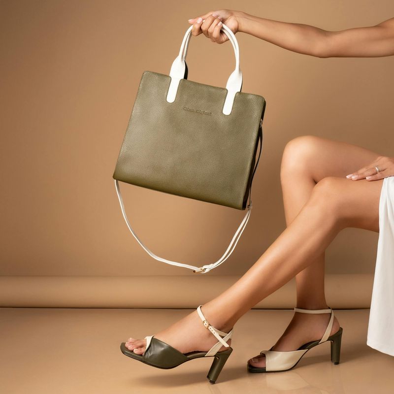
This combination borrows from nature’s own sophisticated design scheme, evoking Mediterranean landscapes and botanical elegance.
The yellowish undertones in ivory complement olive green’s complex hue, creating a harmonious visual relationship. Fabrics matter tremendously with this pairing—think heavyweight linens, raw silks, and fine wools that enhance the natural quality of these colors.
For maximum luxury effect, embrace tonal variations within each color. An ivory cable-knit sweater with slightly creamier buttons alongside olive pants with subtle texture creates depth that catches light beautifully. This thoughtful approach to seemingly simple colors signals the kind of attention to detail associated with luxury dressing.
5. Beige & Blac
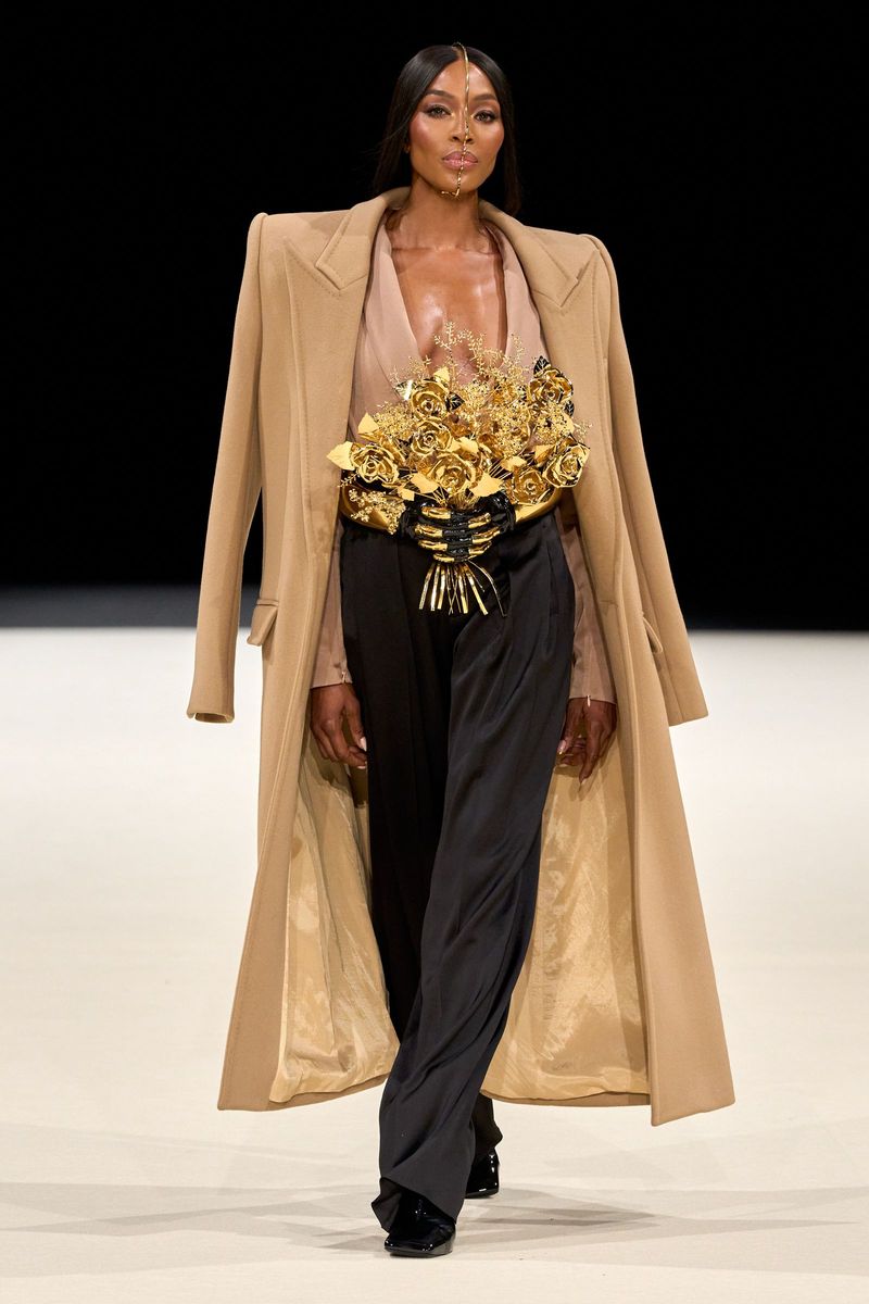
Architectural and assertive, beige and black together create a statement of confidence through restraint. This minimalist pairing channels the aesthetic of luxury fashion houses that have built empires on perfectly executed simplicity.
The contrast creates beautiful definition—black outlines and anchors while beige provides breathing space and lightness. The combination works in any proportion, whether it’s predominantly beige with black accents or the reverse.
Quality becomes immediately apparent in this color scheme, as cheaper fabrics cannot hide in such a stark palette. A well-cut black blazer over a beige slip dress creates effortless elegance, while beige wide-leg trousers with a fitted black turtleneck offers sophisticated balance. Add a single gold accessory for the perfect finishing touch.
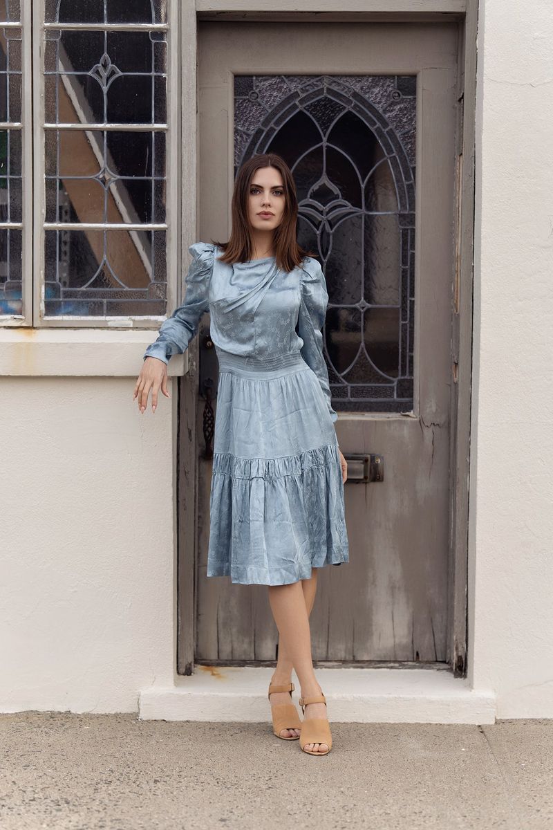
6. Chocolate Brown & Powder Blue

Unexpected yet perfectly complementary, chocolate brown and powder blue create a modern sophistication that feels both grounded and fresh. This pairing offers a refreshing alternative to predictable neutrals while maintaining an air of quiet luxury.
The richness of chocolate brown provides depth and warmth, while powder blue adds a cool, ethereal quality that lifts the combination. The contrast is strong enough to create interest but soft enough to feel harmonious rather than jarring.
Try a chocolate brown leather skirt with a powder blue cashmere sweater, or tailored brown trousers with a structured blue button-down. The combination particularly shines in fall and winter, though it can work year-round with the right fabrics and styling. For maximum impact, keep accessories in complementary metals like brushed gold or bronze.
7. Burgundy & Taupe
The rich, wine-inspired depth of burgundy speaks of heritage luxury, while neutral taupe provides a sophisticated backdrop that never competes for attention.
This combination excels in creating tonal harmony rather than stark contrast. The warm undertones in both colors create a cohesive look that appears thoughtfully curated rather than randomly assembled.
For maximum impact, play with textures—a burgundy velvet blazer with taupe wool trousers, or a taupe silk blouse with a burgundy leather skirt. The combination works beautifully for both daytime sophistication and evening elegance. When accessorizing, opt for antiqued metals rather than bright golds or silvers to maintain the rich, understated quality of this color pairing.
8. Ecru & Slate Blue
This combination feels especially current in its rejection of high-contrast pairings, instead embracing a more subtle approach to color harmony.
The warm neutral tone of ecru—not quite white, not quite beige—provides a soft foundation that allows slate blue’s complexity to shine. Neither color overwhelms the other, creating a balanced partnership that feels intentional rather than accidental.
For maximum sophistication, embrace this pairing in simple, architectural silhouettes that let the colors themselves become the statement. An ecru oversized blazer with slate blue tailored trousers creates effortless elegance, while a slate blue knit with ecru wide-leg pants offers relaxed refinement. The combination particularly shines when executed in premium materials with minimal embellishment.
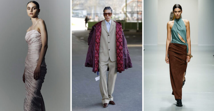
9. Forest Green & Camel
Forest green and camel together create a palette that evokes luxury. This combination borrows from the traditional color schemes of country estates and equestrian pursuits, bringing a timeless quality to contemporary wardrobes.
The deep richness of forest green provides a beautiful counterpoint to camel’s warm neutrality. Neither color dominates, instead creating a partnership that feels balanced and intentional.
A camel coat with forest green accessories creates classic elegance, while forest green tailored pieces with camel accents offer sophisticated versatility. This combination works beautifully year-round but feels especially luxurious in fall and winter. For maximum impact, incorporate subtle textures like herringbone, tweed, or fine ribbing that add dimension without distracting from the color harmony.
10. Stone Gray & White
his pairing channels the aesthetic of modern luxury—clean lines, thoughtful proportions, and quality materials that speak for themselves.
The soft coolness of stone gray provides more dimension than harsh black, while still offering structure and grounding to pure white. Together they create a canvas where silhouette and texture become the focus.
A stone gray cashmere sweater with white jeans creates effortless weekend luxury, while a white silk blouse with stone gray tailored trousers offers versatile workweek elegance. For maximum impact, maintain this color scheme throughout your entire look, including accessories—think silver-toned jewelry, gray suede shoes, or a structured white bag. This commitment to color cohesion signals intention and sophistication.
11. Black & Soft Gold
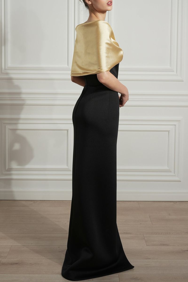
This dramatic pairing channels the timeless luxury of evening wear while adapting it for everyday sophistication.
The depth of black creates the perfect backdrop for soft gold to shine without appearing flashy. Unlike bright yellow gold, soft gold has a muted quality that feels more intentional and refined.
A black cashmere sweater with gold-toned jewelry creates effortless elegance, while black tailored pieces with subtle gold buttons or hardware offer sophisticated detail. For maximum impact, keep the gold elements understated—think a matte finish rather than high shine, and integrated details rather than obvious statements. This restraint is what distinguishes true luxury from its imitators.
12. Plum & Dusty Beige
The rich depth of plum provides a beautiful counterpoint to the quiet neutrality of dusty beige. Neither color overwhelms, instead creating a balanced dialogue that feels intentional rather than accidental.
A plum silk blouse with dusty beige tailored trousers creates elegant versatility, while a dusty beige coat over a plum dress offers sophisticated contrast.
This combination works beautifully in both structured and flowing silhouettes, and particularly shines in luxurious fabrics with subtle texture. For maximum impact, keep accessories minimal and within the same color family.
Comments
Loading…