9 Color Mistakes That Are Secretly Washing You Out After 60
As we age, our skin tone and features naturally change, but many of us keep wearing the same colors we’ve always loved. This can be a mistake that leaves you looking tired, washed out, or older than you feel. The right colors can brighten your complexion, highlight your best features, and bring a youthful glow back to your face.
1. Wearing Colors That Are Too Muted or Dusty
Those soft, dusty hues might seem like gentle choices for mature skin, but they’re actually doing you no favors. As we age, our skin naturally loses pigmentation and contrast, making these muted tones blend right into your complexion rather than enhancing it.
The dusty rose or sage green that looked sophisticated in your 40s might now be making you appear tired or sallow. These colors lack the vibrancy needed to counteract the natural fading that occurs with mature skin.
Instead, reach for clearer, more saturated versions of colors you love. Swap dusty pink for raspberry, replace sage with emerald, or trade taupe for rich camel. These brighter options will bring life back to your face and create a more vibrant, youthful appearance.
2. Ignoring Your Skin’s Undertones
Many women have worn the wrong colors for decades without realizing it, but after 60, these mismatches become much more noticeable. Your skin’s undertone—whether warm, cool, or neutral—becomes increasingly important as your complexion naturally changes with age.
Wearing colors that clash with your undertone can make you look sallow, tired, or even ill. For example, cool blues and purples can look harsh on someone with warm golden undertones, while earthy oranges and yellows might drain someone with cool pink undertones.
To determine your undertone, look at the veins in your wrist—blue veins suggest cool undertones, green veins indicate warm undertones. Once you know yours, choose colors that complement rather than fight against your natural coloring.
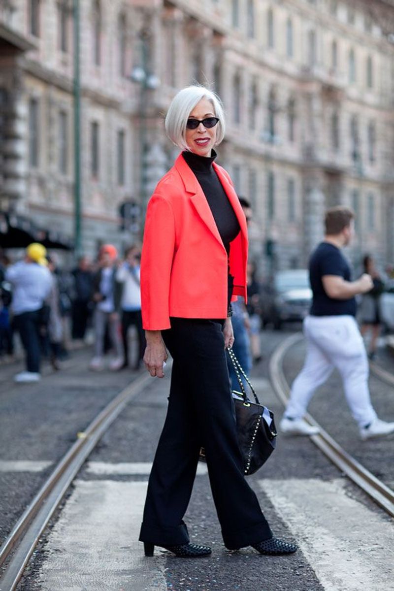
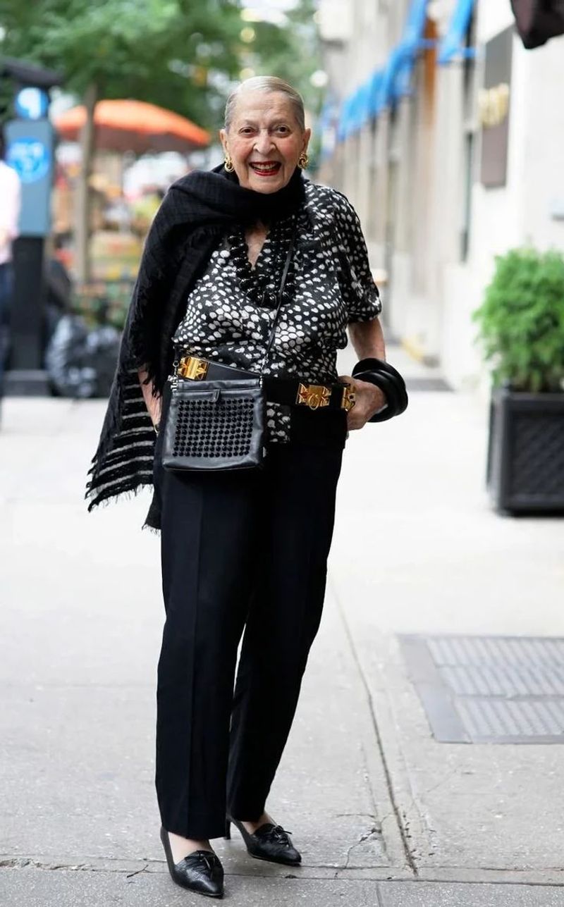
3. Too Much Black in Your Wardrobe
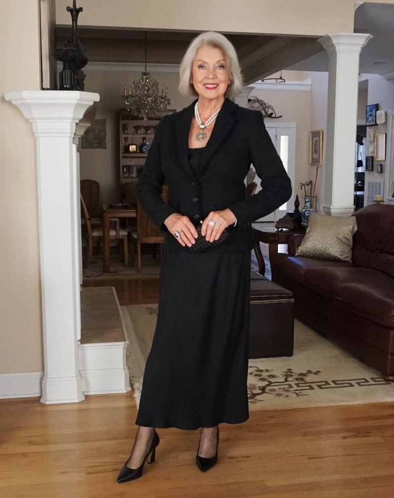
Black has long been praised as chic, slimming, and sophisticated. While it remains a fashion staple, wearing too much black directly against your face after 60 can be unflattering and aging. The stark contrast can emphasize fine lines, wrinkles, and shadows under the eyes.
Black absorbs light rather than reflecting it onto your face, which can make your complexion appear duller and more tired. This is especially true for women who have naturally softened coloring as they’ve aged.
You don’t need to abandon black entirely—just be strategic. Wear black pants or skirts paired with more flattering colors near your face, or soften black tops with colorful scarves. Better yet, replace some black items with navy, charcoal, or deep plum, which offer the same sophistication with a gentler effect.
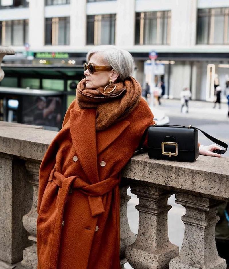
4. Clinging to Your Old Color Palette
Remember that perfect shade of teal that made your eyes pop in your 30s? Unfortunately, it might not be doing you any favors now. Our coloring naturally shifts as we age—hair lightens or grays, skin tone changes, and even eye color can appear less vibrant.
Many women make the mistake of emotional attachment to certain colors, continuing to wear them long after they’ve stopped being flattering. That burnt orange that complemented your auburn hair might clash with your now-silver locks. The pastel blue that matched your once-bright eyes might now make you look washed out.
Take a fresh look at your coloring now, not as it was decades ago. Hold different fabric swatches up to your face in natural light and notice which ones make you look refreshed and which ones emphasize tiredness or sallowness.
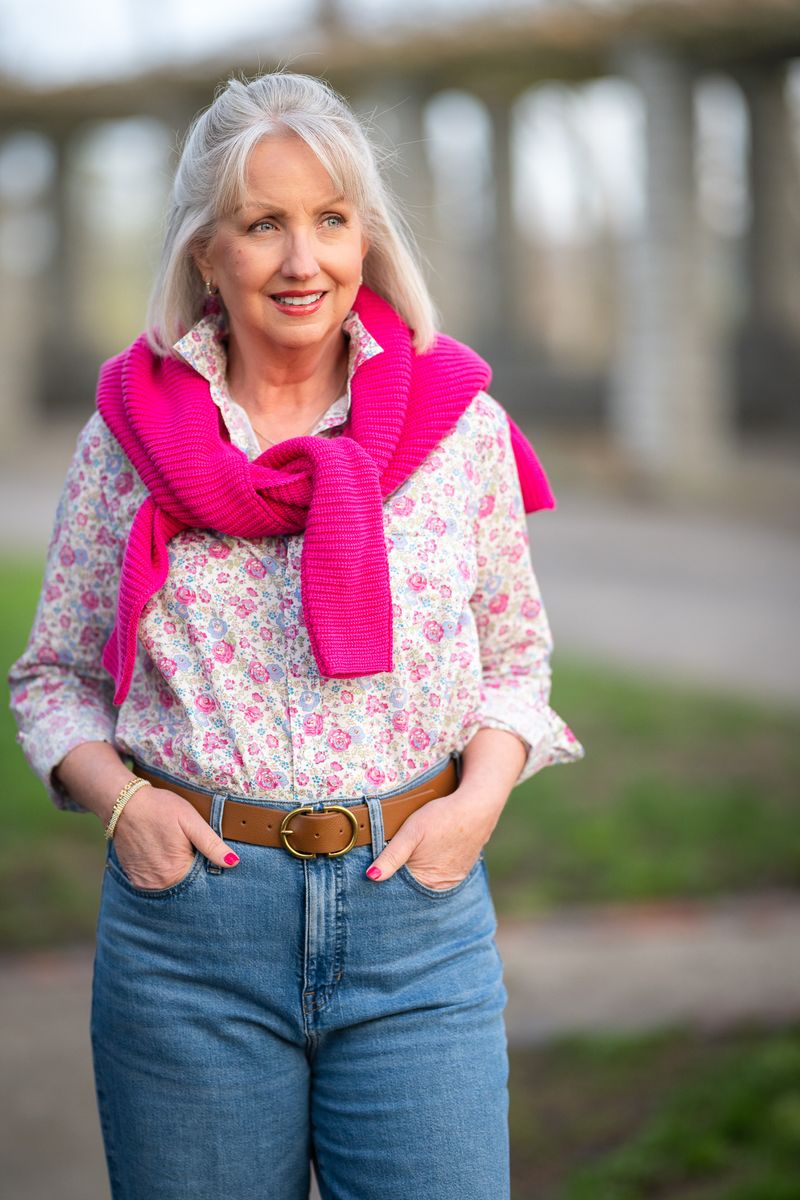
5. Forgetting About Lip-Enhancing Colors
As we age, our lips naturally lose some of their fullness and color. Wearing clothing in shades that echo your most flattering lipstick colors can create a harmonious, brightening effect on your entire face.
Many women focus solely on skin tone when choosing colors, overlooking how clothing can enhance—or detract from—their lips and overall facial balance. Tops in colors that clash with your lip tone can make your mouth appear washed out or create an unintended contrast.
Experiment with wearing tops, scarves, or necklaces in shades that complement your favorite lipstick. If coral lipstick brightens your face, try a coral blouse or scarf. If berry tones make your lips look fuller, incorporate those shades near your face for a cohesive, flattering effect that brings youthful color back to your complexion.
6. Keeping Color Away From Your Face
Colorful pants with a beige top might seem like a safe choice, but this common approach misses a crucial opportunity to enhance your appearance. The most impactful place for flattering colors is near your face, not your lower body.
Many women over 60 gravitate toward neutral tops and colorful bottoms, perhaps thinking it’s more slimming or sophisticated. However, this strategy places your most vibrant colors where they can’t work their magic on your complexion. Colors worn near your face reflect light onto your skin, potentially brightening your eyes and giving your complexion a healthy glow.
Reserve your most flattering colors for tops, scarves, earrings, and necklaces. Even if you prefer neutral wardrobes, a colorful scarf or statement necklace near your face can instantly brighten your appearance and draw attention to your best features.
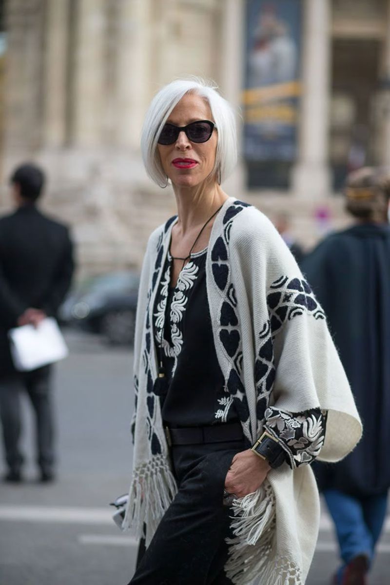
7. Missing the Contrast Connection
Have you noticed outfits that once looked striking now seem to fall flat? As we age, the natural contrast between our hair, skin, and features often diminishes. What many women don’t realize is that their clothing contrast should adjust accordingly.
High-contrast outfits (like black and white combinations) can look harsh on someone whose own coloring has softened with age. Conversely, low-contrast outfits might make someone with naturally high contrast features disappear into a sea of sameness.
Find your sweet spot by matching your clothing contrast to your natural coloring. If your hair has silvered against still-vibrant skin, you can handle moderate contrast. If everything has softened, gentler transitions between colors will be more flattering. The right level of contrast can recreate that natural definition that may have faded with time.
8. Selecting the Wrong Shade of White
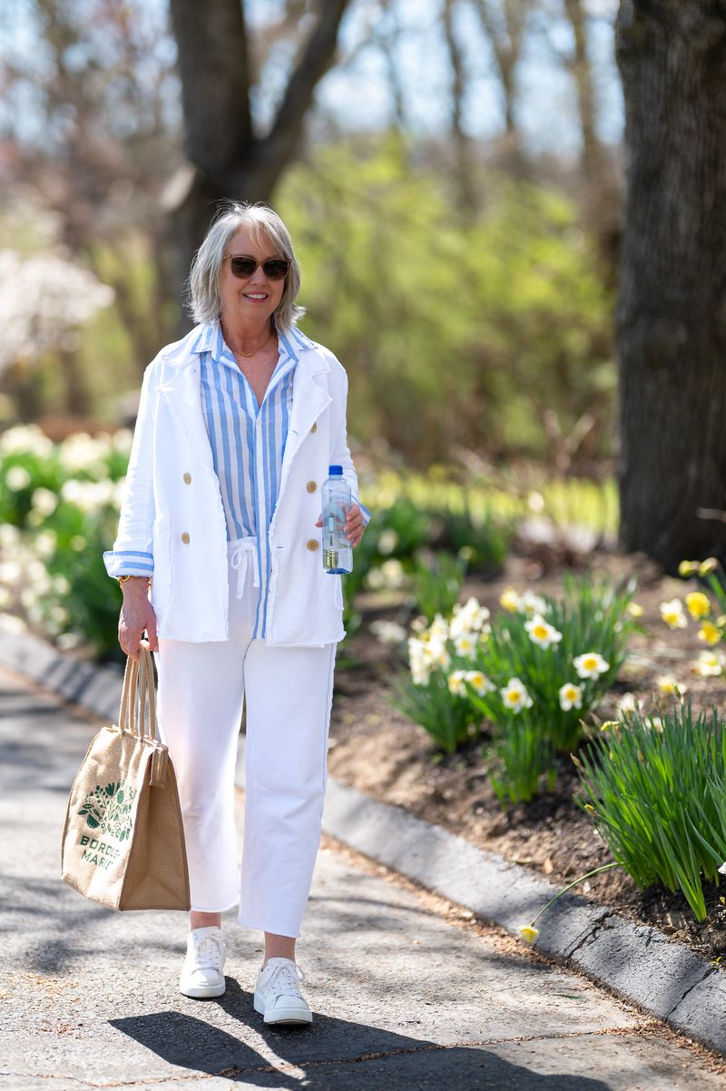
White seems simple enough, but choosing the wrong shade of this supposedly neutral color can be surprisingly aging. Stark, bright white can create harsh shadows and highlight imperfections, especially under the chin and around the eyes.
Many women don’t realize there’s a spectrum of whites, from cool blue-whites to warm ivory tones. The key is matching your white to your personal undertone. If you have warm undertones, stark white might make you look sallow or tired, while creamy ivory or soft ecru will bring warmth to your complexion.
For those with cool undertones, bright white or icy white can look crisp and refreshing, while yellowy whites might drain your complexion. A simple test: hold different white fabrics near your face in natural light and notice which ones brighten your complexion versus those that create shadows or dullness.
9. Neglecting Hair Color Coordination

Your silver strands are beautiful, but are your clothes still playing nicely with them? One of the most overlooked color mistakes happens when women don’t adjust their wardrobes to complement their changing hair color.
Gray, silver, or white hair creates a new color dynamic around your face. Colors that worked beautifully with your former brunette or blonde shade might now clash with your silvery tresses. For instance, certain yellows or beiges that blend too closely with gray hair can create a dull, washed-out effect.
Embrace colors that enhance your new hair shade! Silver hair looks stunning with jewel tones like emerald, sapphire, and amethyst. It also pairs beautifully with clear pastels and navy. The contrast between these colors and your silver hair creates a sophisticated, intentional look that celebrates rather than fights against your natural changes.
Comments
Loading…