12 Movies That Use Color to Tell a Deeper Story
Movies are more than just moving pictures and dialogue. Some filmmakers use color like a secret language, painting emotions and hidden meanings right onto the screen.
Whether it’s a pop of red in a black-and-white world or an entire palette that shifts with a character’s mood, color can say things words never could. These 12 films are masterclasses in visual storytelling, and once you notice the color choices, you’ll never watch movies the same way again.
1. The Grand Budapest Hotel (2014)
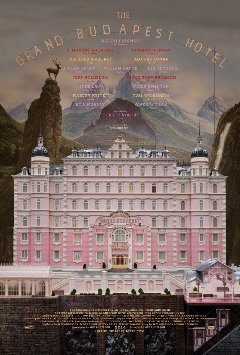
Wes Anderson treats color the way a painter treats a canvas — deliberately, obsessively, and brilliantly.
In The Grand Budapest Hotel, each era of the story is bathed in its own distinct color palette.
The 1930s sequences burst with pinks, purples, and warm golds, reflecting a world of elegance and fantasy.
As the story moves into darker decades, the palette cools and fades, almost like a photograph left in the sun too long.
Anderson’s pastel universe isn’t just decorative — it signals nostalgia, loss, and the bittersweet passing of a more charming world.
2. Schindler’s List (1993)

Steven Spielberg made one of the boldest color decisions in cinema history — he shot almost the entire film in black and white.
The bleached, ghostly imagery strips away comfort and forces viewers to sit inside the horror of the Holocaust without any visual escape.
But then comes the red coat.
A small girl in a single splash of red wanders through the chaos, and suddenly the screen feels electric.
That one color transforms an anonymous tragedy into a heartbreaking individual story.
Later, when Schindler sees her coat again, the red becomes unbearable — a symbol of all he could not save.
3. Hero (2002)
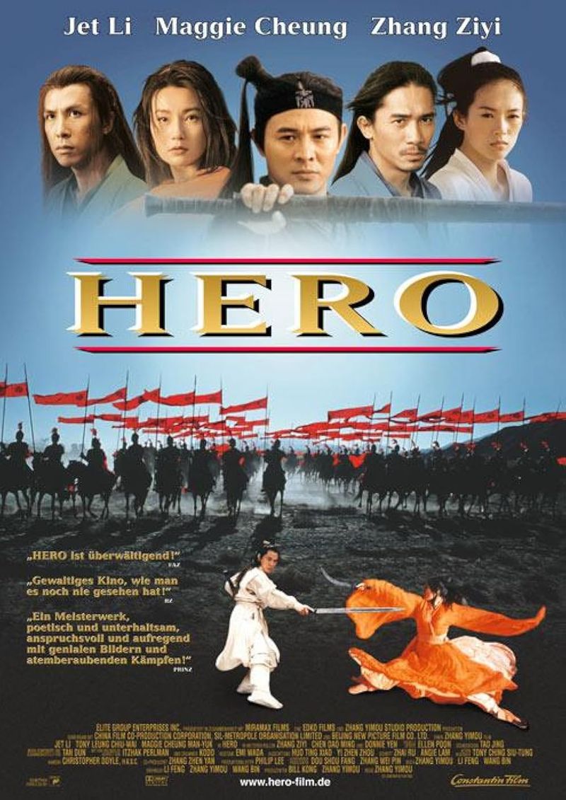
Zhang Yimou’s Hero takes color-coded storytelling to a whole new level — literally.
Each chapter of the film is told in a completely different color scheme: red, blue, white, and green.
These aren’t random choices; each color represents a different version of the truth being told.
Red pulses with passion and deception.
Blue carries sadness and longing.
White signals purity and sacrifice.
Green speaks of nature and memory.
It’s like watching four different emotional films wrapped into one stunning visual experience.
Hero proves that color can function as a narrator, guiding audiences through layers of meaning without speaking a single extra word.
4. Drive (2011)
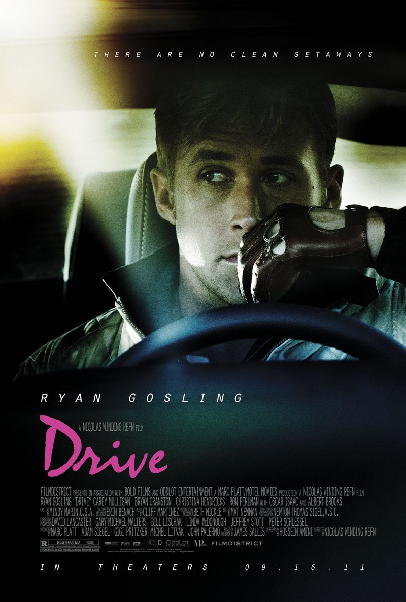
Cool, quiet, and soaked in neon — Drive uses color to build a world that feels both beautiful and dangerous.
Director Nicolas Winding Refn bathes nighttime Los Angeles in electric pinks, deep purples, and icy blues, creating a dreamlike atmosphere that hides something sinister underneath.
The warm glow of Ryan Gosling’s apartment scenes contrasts sharply with the cold neon violence of the streets.
That tension between warmth and coldness tells you everything about the Driver’s character — a man capable of tenderness who lives in a world of brutality.
The color doesn’t decorate Drive; it defines it.
5. Amélie (2001)
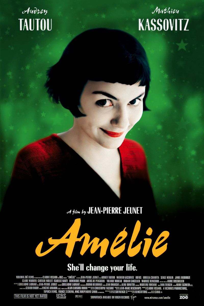
Warm reds and deep greens flood almost every frame of Amélie, and that’s no accident.
Director Jean-Pierre Jeunet and cinematographer Bruno Delbonnel deliberately boosted these colors in post-production to create a Paris that feels like a fairy tale — vibrant, slightly unreal, and full of wonder.
The heightened color palette mirrors Amélie’s own imagination.
She sees the world as magical and full of possibility, so the film shows it that way too.
When you notice how consistently warm this film looks, you realize the color itself is a character — one that tells you this is a story about choosing joy over sadness.
6. Moonlight (2016)
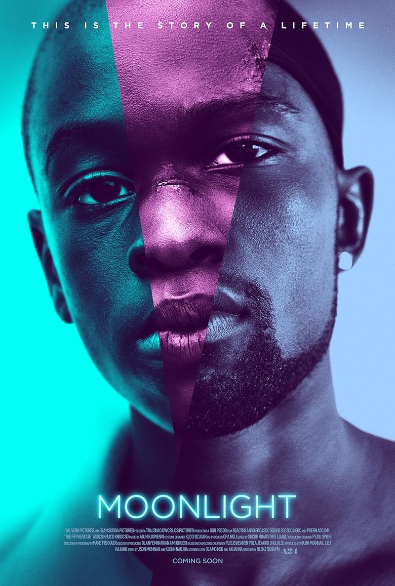
Barry Jenkins and cinematographer James Laxton used color in Moonlight to communicate what the characters themselves could not say out loud.
Blue dominates the film’s visual language — cool, aching, and beautiful.
It wraps around Chiron like a second skin, suggesting vulnerability, isolation, and a deep emotional longing.
Fun fact: Jenkins referenced the paintings of artist Kerry James Marshall when developing the film’s look, specifically to ensure Black skin tones were lit with richness and dignity.
The result is breathtaking.
Every shade of blue in Moonlight carries emotional weight, turning the color itself into a meditation on identity, tenderness, and the search for belonging.
7. The Matrix (1999)
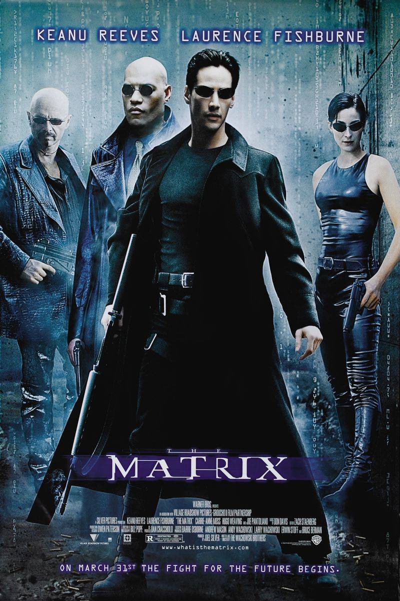
Ever notice how everything inside the Matrix has a slight green tint?
That wasn’t a camera glitch — it was a deliberate creative choice by the Wachowskis.
The green hue was inspired by the color of old monochrome computer monitors, visually coding the simulated world as something artificial and machine-made.
Meanwhile, scenes set in the real world lean toward cold blues and grays, stripped of any digital warmth.
This color contrast constantly reminds viewers which reality is which.
The green becomes almost suffocating by the film’s end, making the cold blue of truth feel like a breath of fresh air.
Color as code — pure genius.
8. In the Mood for Love (2000)
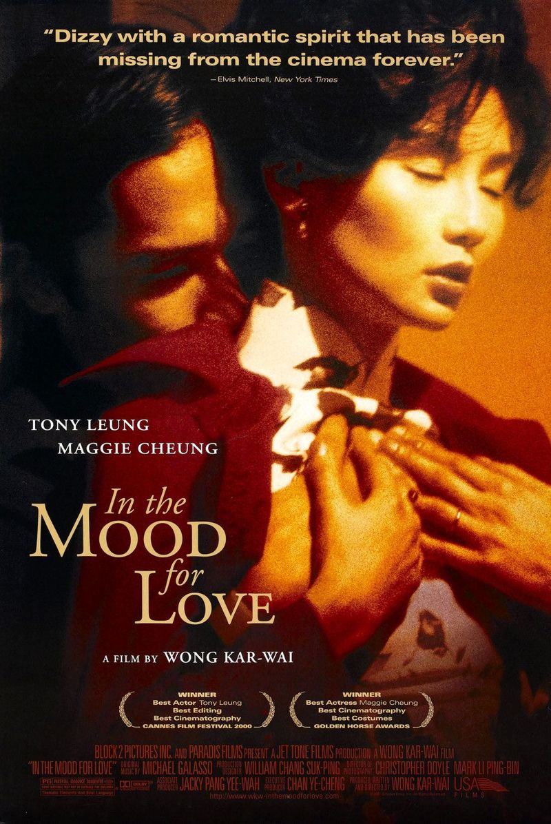
Wong Kar-wai’s masterpiece burns with longing, and the color tells you that before a single word is spoken.
Deep reds, burnt oranges, and shadowy greens fill every cramped apartment hallway and rain-soaked alley in 1960s Hong Kong.
The richness of the palette feels almost suffocating — like desire itself pressing against the walls.
Cinematographer Christopher Doyle used slow motion and tight framing to trap characters inside these gorgeous, aching colors.
The lush warmth of the film’s palette is bittersweet — it makes everything look precious and fleeting, perfectly matching a love story about two people who can never fully express what they feel for each other.
9. La La Land (2016)
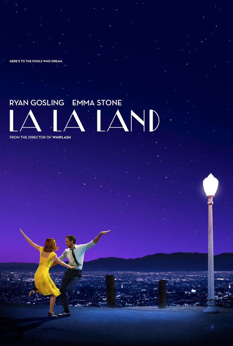
Damien Chazelle and cinematographer Linus Sandgren soaked La La Land in bold primary colors — canary yellow, cobalt blue, cherry red — to evoke the golden age of Hollywood musicals.
Every frame feels like a vintage postcard brought to life, buzzing with the electric energy of ambition and romance.
But pay close attention: as the film progresses toward its bittersweet conclusion, the saturated colors begin to soften and fade.
The visual world quietly mirrors the characters’ shifting dreams.
What starts as a dazzling color explosion gradually matures into something more muted and real — a subtle, gorgeous reminder that growing up sometimes means letting go of the brightest colors.
10. Blade Runner 2049 (2017)
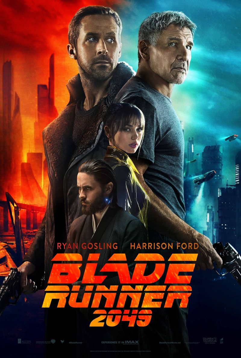
Roger Deakins won a well-deserved Oscar for his work on Blade Runner 2049, and color is a huge reason why.
The film’s world is divided into distinct color zones, each carrying its own emotional atmosphere.
The grey-blue of Los Angeles signals a world of surveillance and cold control.
The blinding orange of the Las Vegas wasteland evokes decay, isolation, and a kind of apocalyptic beauty.
White clinical environments signal power and artificiality.
Each location has its own color identity, almost like emotional territories on a map.
Deakins uses color not just to look stunning — though it absolutely does — but to define the soul of every space the story inhabits.
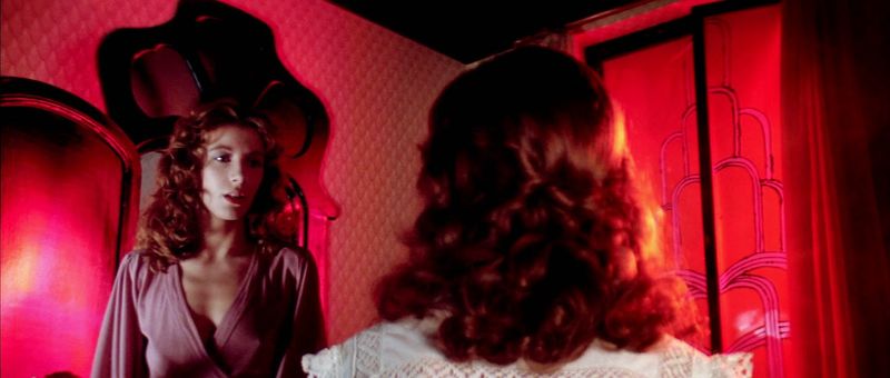
11. Suspiria (1977)
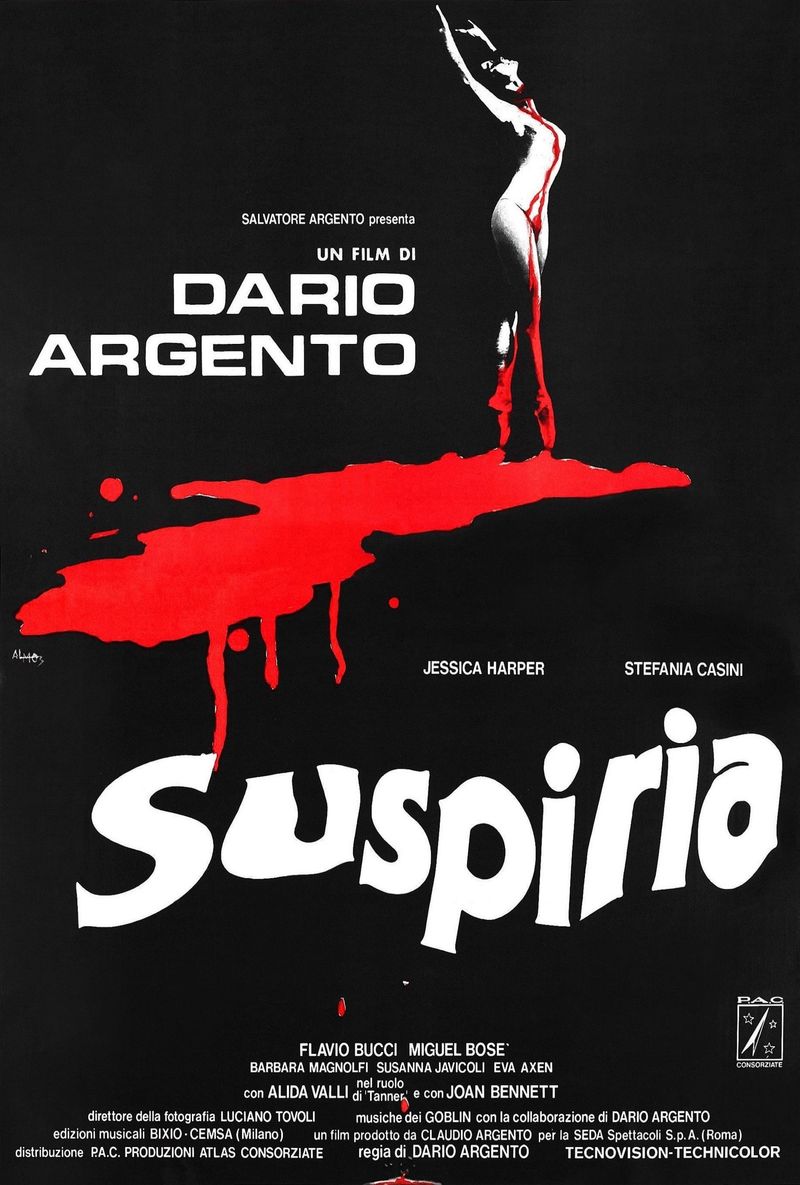
Dario Argento’s Suspiria doesn’t just use color — it weaponizes it.
Shot using an old Technicolor process, the film explodes with reds, blues, and greens so intense they feel physically aggressive.
Walking into this witch-haunted ballet school feels like stepping inside a fever dream painted by someone with no interest in being subtle.
The color choices were directly inspired by Disney’s Snow White, of all things — Argento wanted that same hyper-saturated fairy tale quality, but twisted into something nightmarish.
The result is unforgettable.
Suspiria proves that color can be genuinely frightening, turning a visual element into a source of pure, disorienting dread that gets under your skin.
12. Mad Max: Fury Road (2015)
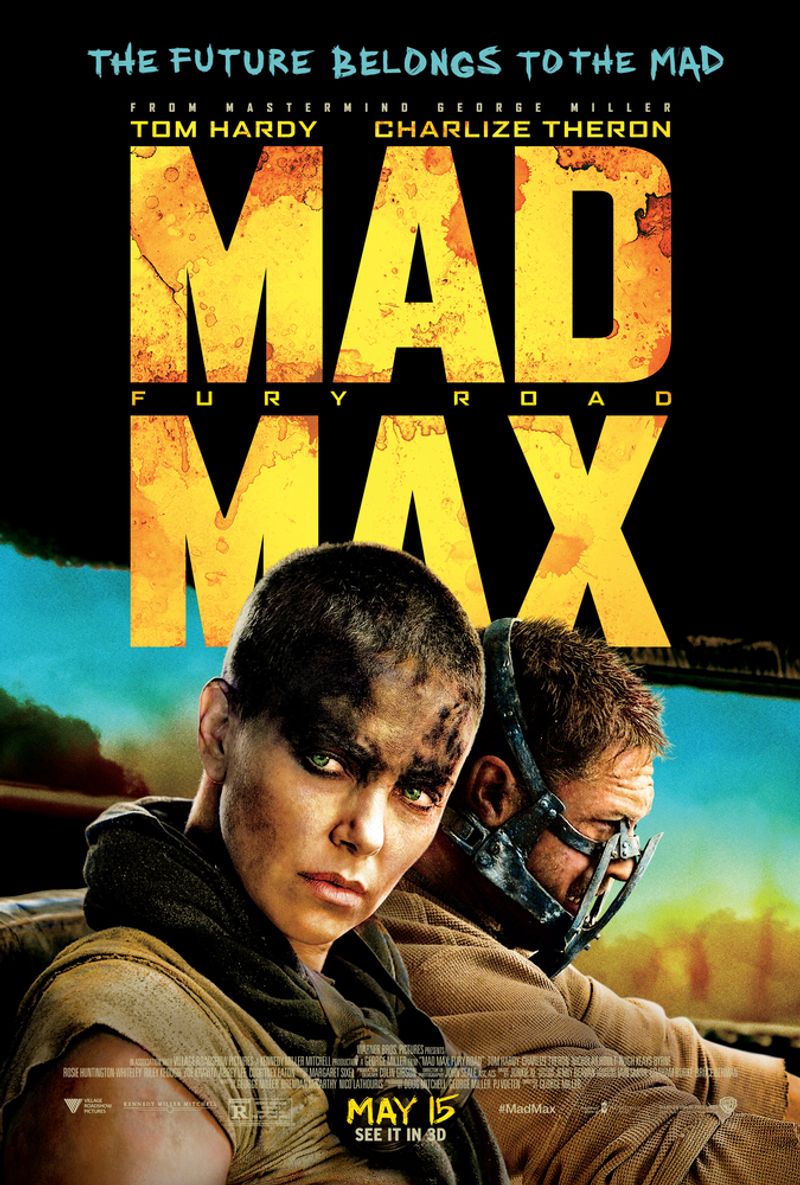
George Miller and cinematographer John Seale built Fury Road’s iconic look around one stunning contrast: scorched orange earth versus a cold, almost supernatural teal sky.
This orange-and-teal combination became the film’s visual heartbeat, making every frame feel like a painting on fire.
Interestingly, the daytime scenes were actually shot at night and color-corrected to look like blazing daylight — a technique called day-for-night in reverse.
The saturated orange world communicates desperation, violence, and survival at its rawest.
But that sliver of teal sky above?
It quietly holds the possibility of hope.
Fury Road is proof that even in the most chaotic cinema, color is always whispering something.
Comments
Loading…