4 Aging Color Combos to Avoid & 4 That Work Wonders for Your Look
The colors we wear can make a big difference in how youthful and vibrant we look. Some color combinations can add years to our appearance, while others can take them away. Knowing which color pairings to embrace and which to avoid can transform your wardrobe and boost your confidence.
1. Beige and Brown
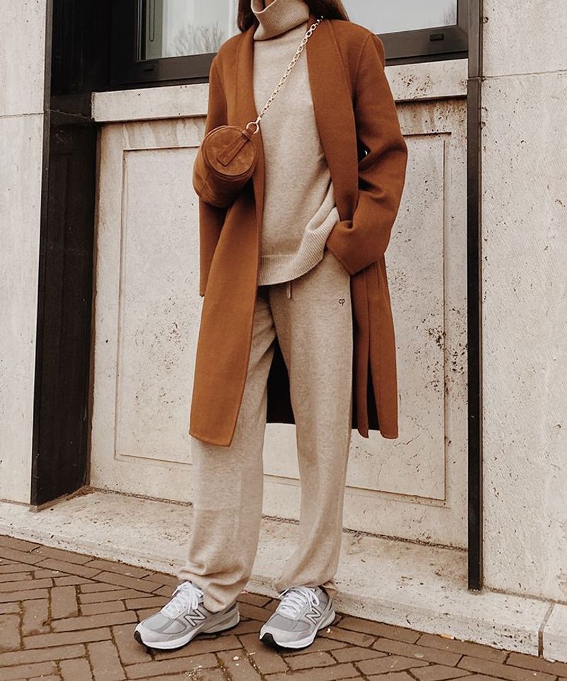
When paired together, beige and brown create a washed-out effect that can drain your complexion of vitality. This earthy combination often looks dated and can make your skin appear dull and lifeless.
The lack of contrast between these two neutral shades fails to create visual interest or bring any brightness to your face. Many fashion experts refer to this combo as the “invisible outfit” because it tends to blend into the background rather than make a statement.
For those with warm undertones especially, this pairing can emphasize yellow tones in the skin, highlighting fine lines and wrinkles rather than creating a fresh, youthful appearance.
2. Olive Green and Mustard
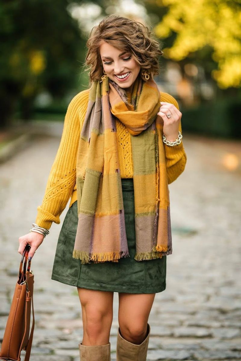
Combined, olive green and mustard yellow create a murky palette that can cast unflattering shadows on your face. These muddy tones tend to emphasize sallowness in the skin, making you appear tired and older than you are.
Both colors contain yellow-green undertones that can bring out similar tones in your complexion, especially around the eyes and mouth where signs of aging first appear. The vintage feel of this combination, while occasionally trendy, often reads as outdated rather than retro-chic.
Women over 40 particularly should approach this color duo with caution, as it can highlight discoloration and uneven skin tone that becomes more common with age.
3. Dull Gray and Faded Navy
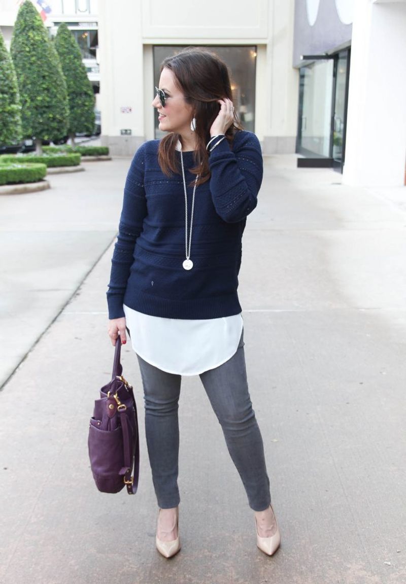
Nothing ages a look faster than the combination of dull gray and faded navy. These two colors, when lacking vibrancy, create a somber, lifeless effect that can make you appear worn out and drained.
The problem lies in the muted quality of both shades – they create no visual lift or brightness near your face. Dark circles and fine lines become more pronounced against this backdrop of faded hues.
Corporate wardrobes often fall into this trap, with countless women wearing this aging combination day after day. The lack of contrast or interest fails to highlight your best features, instead creating a forgettable look that adds years to your appearance.
4. Pale Yellow and Light Gray
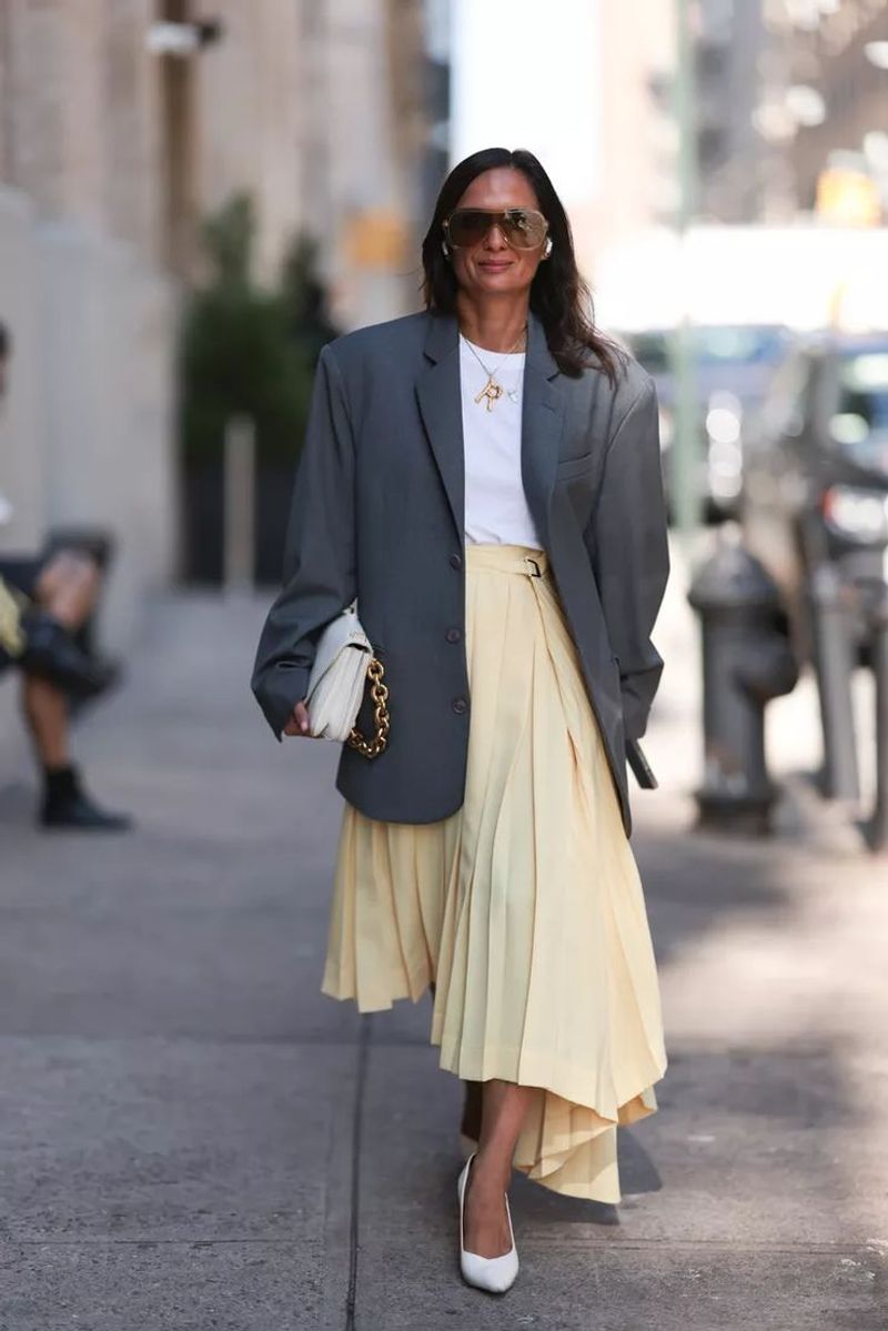
Pale yellow and light gray together create a washed-out effect that does nothing to enliven your complexion. This combination lacks the contrast needed to define features and can make you appear tired and older.
The problem intensifies for those with fair skin, as these light, low-saturation colors blend into your natural coloring rather than enhancing it. Many women notice that under artificial lighting, this combo is particularly unflattering, emphasizing shadows around the eyes and mouth.
Fashion photographers often avoid this pairing because it photographs poorly, creating a bland, almost sickly appearance that no filter can fully correct. Even younger wearers find this combination adds years to their look.
5. Navy and Crisp White
The contrast of navy and white brings light to the face while keeping the overall look refined and modern. It’s a timeless match that feels both sophisticated and fresh at any age.
The deep richness of navy provides structure and slimming properties, while white reflects light onto the face, minimizing shadows that can age you. French women have long embraced this combination as a cornerstone of ageless style.
Versatility makes this duo especially valuable – it transitions seamlessly from casual to formal occasions. Adding a pop of red lipstick to this combination creates an especially vibrant look that draws attention to your smile rather than fine lines or wrinkles.
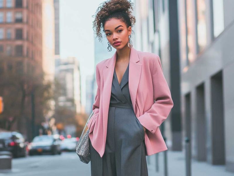
6. Soft Pink and Charcoal Gray

The warmth of soft pink instantly refreshes the face, and charcoal gray grounds the look with quiet sophistication. Paired together, they strike a perfect balance of softness and polish.
The gentle warmth of soft pink counteracts dullness in mature skin, reflecting a rosy glow that mimics the natural flush of youth. Meanwhile, charcoal gray offers a contemporary neutral base that’s more forgiving than stark black.
Celebrity stylists frequently choose this pairing for clients over 40 because it photographs beautifully and creates a put-together look without trying too hard. The contrast between these colors creates visual interest while remaining subtle enough for everyday wear.
7. Bright Red and Black
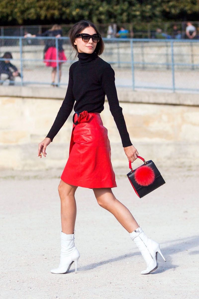
Bold and dramatic, bright red paired with black creates an instantly energizing effect that draws attention away from signs of aging. The vibrant red brings healthy color to the face while black provides a slimming, sophisticated foundation.
Red stimulates circulation and creates the appearance of vitality, counteracting the dullness that can come with mature skin. Fashion psychology studies have shown this combination projects confidence and authority, qualities that naturally make you appear more youthful and vibrant.
A red statement piece against black creates a focal point that directs attention exactly where you want it. This high-contrast pairing works especially well for special occasions when you want to make a memorable impression that’s both timeless and striking.
8. Lavender and Soft Beige
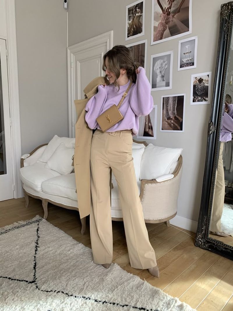
With cool undertones that lift and brighten, lavender works to neutralize dullness in the skin. Combined with soft beige, it creates a subtle glow that feels fresh and effortlessly elegant.
The soft contrast between these colors creates dimension without harshness. Color specialists often recommend this pairing because it mimics the natural light-reflecting properties of youthful skin.
Even women with concerns about looking too “girly” in purple find that the sophisticated lavender and beige combination reads as elegant rather than juvenile. This pairing works especially well in lightweight fabrics that move naturally, creating a graceful look that’s both age-appropriate and youthful.
Comments
Loading…