Logos are more than just symbols; they are powerful tools for communication, often hiding clever messages in plain sight. Here’s a look at some smart food brand logos that have mastered the art of subtly embedding hidden meanings in their designs.
Baskin-Robbins
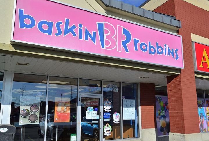
At first glance, the Baskin-Robbins logo’s playful pink and blue colors seem straightforward. However, the “BR” in the logo cleverly incorporates the number “31” in pink, representing the brand’s promise of 31 flavors, one for each day of the month.
Tostitos
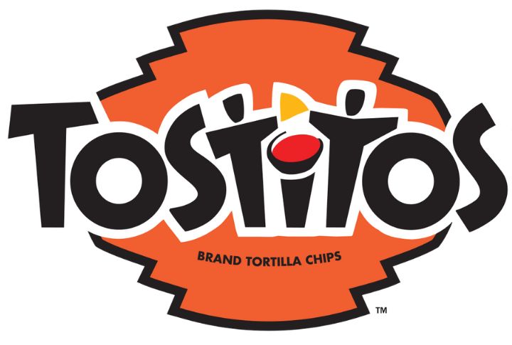
The Tostitos logo might look like stylized text. Still, a closer look reveals two of the “Ts” illustrate people sharing a chip over a bowl of salsa in the “i.” This unseen imagery emphasizes the social aspect of enjoying Tostitos with friends and family.
Hershey’s Kisses
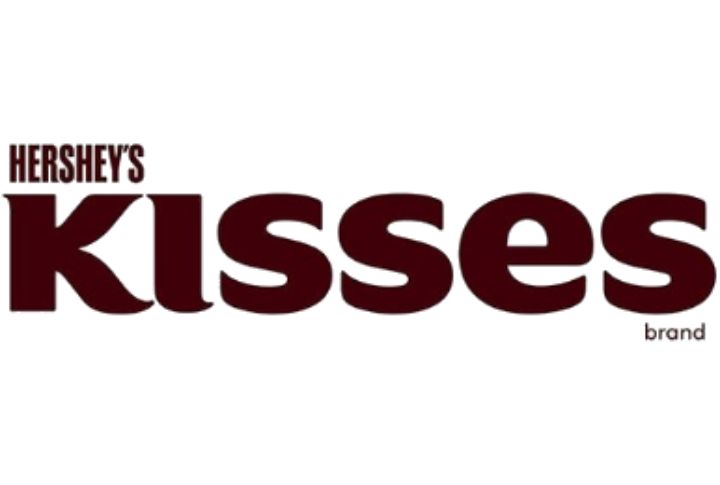
Believe it or not, the Hershey’s Kisses’ logo is basically a subtle nod to its product. Between the letters “K” and “I” in “Kisses,” you can spot a tiny Hershey’s Kiss shape, showcasing the iconic chocolate in a brilliant manner.
Wendy’s
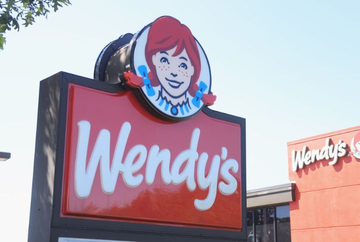
The goal of Wendy’s logo is to evoke feelings of fondness and home-cooked meals. Concealed in the collar of Wendy’s shirt are the letters “mom,” reinforcing the brand’s homey, family-friendly image.
Coca-Cola
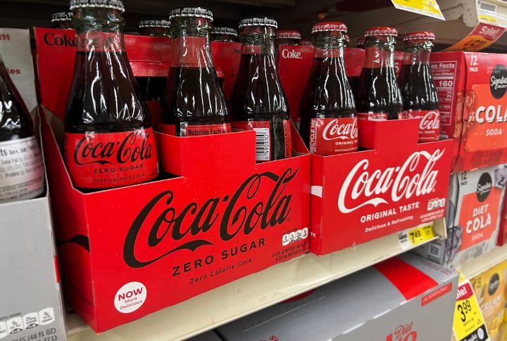
There’s no denying that the Coca-Cola logo is globally recognized, but few notice the hidden Danish flag in the letter “o.” This was highlighted during a marketing campaign in Denmark, adding a cultural connection to the favorite brand.
Toblerone
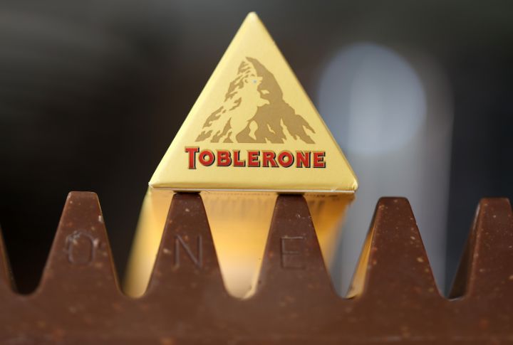
The Toblerone logo, depicted as the image of the Matterhorn mountain, contains a secret bear inside the mountain’s design. This embodies the chocolate’s origin in Bern, Switzerland, also known as the city of bears.
Pepsi
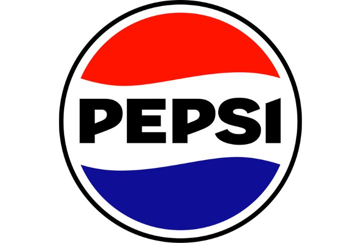
With its globe-like red, white, and blue logo, Pepsi’s logo has a low-key reference to the brand’s history and mission. The white space in the middle appears like a wavy line that represents life’s natural balance and symmetry, resonating with the brand’s message of positivity and refreshment.
Subway
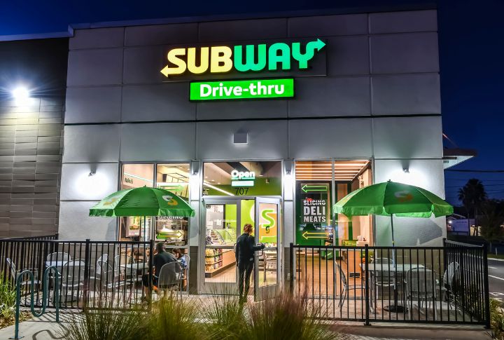
The Subway logo includes arrows on the “S” and “Y,” depicting the entrance and exit of a subway station. This casually suggests the convenience and speed of getting a quick meal, aligning with Subway’s fast-food concept.
Spartan
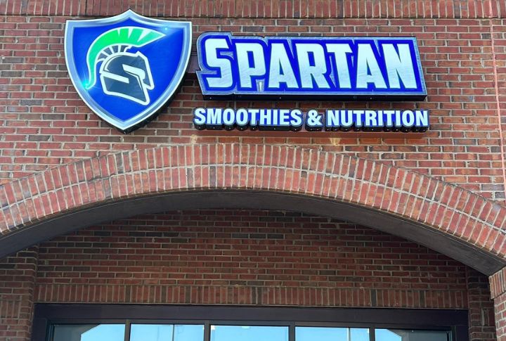
By cleverly combining two images — a man in profile enjoying yogurt and a Spartan warrior wearing a helmet — the Spartan yogurt logo communicates the brand’s message loud and clear. The yogurt-eating figure represents the product’s delicious and nutritious qualities, while the Spartan warrior symbolizes the brand’s Greek heritage and association with strength and health.
Goodwill
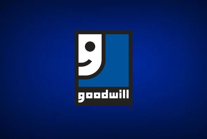
In order to highlight the good effects of their work, Goodwill included a unique “G” in their logo that resembles a smiling face. Though not a food brand, the cheerful logo is usually associated with goodwill stores that carry a variety of items, including food.
Milwaukee Brewers
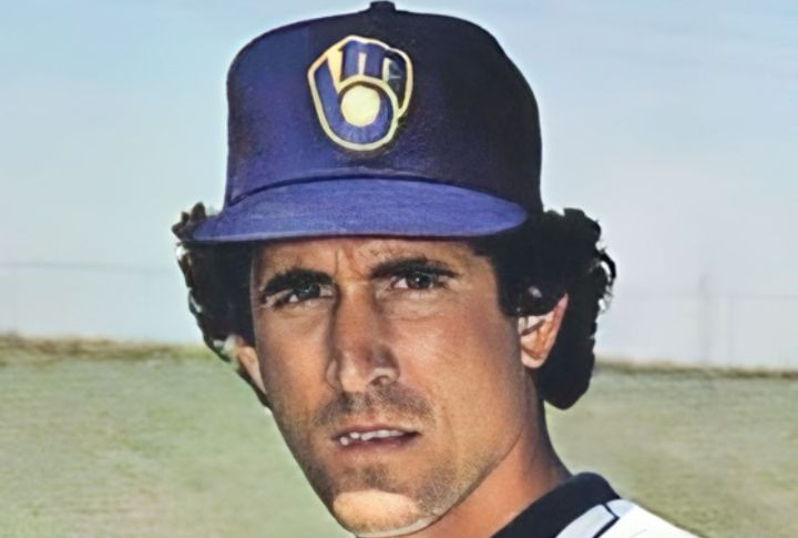
Resembling a baseball glove, the Milwaukee Brewers’ logo comprises the letters “M” and “B”. This disguised design element connects to the brand’s team sponsorship, subtly associating their merchandise with sports and recreation.
Caribou Coffee
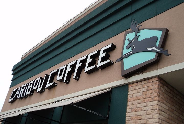
The logo of Caribou Coffee has a coffee bean concealed within the body of the caribou. This small detail strengthens the brand’s focus on coffee while maintaining its natural outdoor aesthetic.
Quiksilver
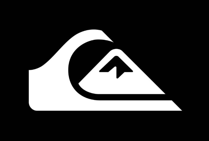
Quiksilver, famed for its surfing and sports gear, has a logo inspired by the famous woodblock print “The Great Wave off Kanagawa.” The camouflaged mountain within the wave aligns with the brand’s adventurous spirit. While not a food brand, its superb design philosophy is mirrored in many food logos.
Comments
Loading…